Sunday, December 22, 2013

CLOSE UP 'DRESS CHANGE'

I was doing my weekly errands in the grocery and I noticed this. I would say it's clearly an improve vs previous: Stature is much cleaner & less complex. Visual elements are simplified to deliver a much refined (and more modern) 'Close Up' experience.

Notwithstanding such improve on pack, it must be still so difficult for Close Up to really compete against leading brands in markets like the Philippines and Indonesia - where Colgate - with its solid base of multi- functional branding underpinned with credibility attributes,  allow the brand to strongly prevail and be well-engrained in consumers' minds.


Tuesday, December 17, 2013

VILAF's 20th Anniversary Brand Mark: Our 1st CI-driven work

Congratulations to VILAF  (Vietnam International Law Firm) on their 20th year of existence. It was actually us who designed their commemorative brand mark. Intent was to bring alive the progressive and dynamic nature of the firm.

Thank you VILAF for embracing AP Branding. If you are looking for a legal expert with a proven track record locally in VN; underpinned with global market exposure and an impressive roster of internationally-trained counsels; visit VILAF  at www.vilaf.com.vn


Saturday, December 14, 2013

SCI-FI PHOTOSHOP CONTEST


Below is a direct quote from Rhys:

-------

Hello to everyone at project Sci-Fi,

I would like to submit my entry for the Scifi Photo and Photoshop contest.

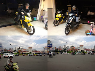
My entry in based on racing the 'Light Cycles' from Tron and Tron Legacy.

Since there are so many motorcycles in Saigon/Ho Chi Minh City, I thought this was a very relevant subject matter.
The backdrop is Ben Thanh Market, complete with roundabout and statue. A very recognisable landmark of Saigon/Ho Chi Minh City
Also a very busy place with traffic coming from all directions. Definitely not a place to be racing motorcycles except in Photoshop.
Finally I thought it would be a nice touch, to use fairly normal motorcycles, the kind you can see every day in Saigon/Ho Chi Minh City, and them transform them in Photoshop. More of a 'Light Scooter'.

I also attach reference to the movie and a low res jpeg of my original shots as proof that this is all my own work. I can provide higher res if requested.

-------

What is the relevance? We are all students in the broad discipline of design. We refuse to be complacent; continuously honing our chops to be better & stronger. This contest is indeed fun and exciting, but also shows of AP Branding's competitive nature. We are committed to underpin our craft and be the best that we could possibly be; so we can continue to delight and excite our clients with work that is moving and engaging. BTW, Rhys did win the Audience Award Category for the contest:)

Friday, December 13, 2013

MORE IS MORE

That saying less is more is still valid. Don't get me wrong. I adhere to it. But flipping this dictum doesn't mean it could be wrong. I doubt it. See this photo. A fitting tribute to the opposite: Abundance and overall fullness being brought ALIVE and into the forefront of one of my favorite cereal brands.

What is your brand story?

Here is a photo of a worn out gym bag. A battlescar no doubt. But look carefully: We notice an iconic brand mark which reminds us of a lot of experiences attached to a certain brand. Experiences which elicit a multitude of stories we have felt at several stages in our own lives: The feeling of a new pair of kicks, making that game winning jumper (or seeing someone make it during an NBA game) or  just a vivid flashback of wearing a shoe exuding such iconicism  & walking through the hallways of your high school gym. These  memories are just so engrained in our minds.  Thanks to brands with powerful stories. Stories allow a brand to become much stronger and more compelling. 

Sagota Beer: First work off our project oven


Current stature wasn’t taken seriously as people perceived Sagota to be a cheap rip off of Heineken. To be fair - Sagota is a great brew - and the task was to let this brew be given justice via christening a unique visual space for the brand (which the redesign strongly delivered). This is fresh folks, as the Sagota rejuvenation only hit the shelves in Vietnam late October 2013.

Who (and what) on earth is AP Branding?!!

Good question. AP Branding literally means 'Alday Prothero'. The studio name comes from its founders Eric Alday and Rhys Prothero. AP also alludes to the business' geographic area of focus: Asia, with an emphasis in SEA. Eric and Rhys have been around the business for quite some time; and they have no intentions to go anywhere and intend to stay here as for  long as they can. They are fueled by their relentless passion to  make clients hAPpy by delivering great work.


To get to know more about us, visit our website: www.ap-branding.com. Send us a note too at info@ap-branding.com 

Our First Crack

As the title says it all, this is our very first post. We are AP Branding Ltd, a 'newish' international design studio incorporated in HK only last year. While we may be a start up, the prime movers aren't exactly 'new' in what they do. They have a combined experience of over 30 years in consumer branding and design; have launched and rejuvenated a multitude of brands covering various categories in multiple markets.

WELCOME TO OUR BLOG.